Top UI Developer Interview Questions and Answers: Read in 10 Minutes

Developer Interview Questions

If you’re preparing for a UI developer interview question, it’s important to be prepared for a number of questions that test your technical skills, problem-solving abilities, and understanding of key web technologies. In this guide, we cover the most frequently asked interview questions for frontend developers, including top questions about HTML, CSS, JavaScript, and React. Whether you’re looking for frontend developer interview questions and answers, UX design interview questions, or general UI developer interview questions, this blog is for you.

Developer Interview Questions

By understanding these commonly asked questions, you’ll gain confidence and insight into the skills interviewers are looking for. Additionally, we will provide you with helpful tips on how to prepare for JavaScript interview questions, UI/UX developer interview questions, and much more.

The Importance of UI/UX in Interviews

UI and UX design play a critical role in how users interact with a product, making them essential areas of focus in frontend development interviews. UI developer interview questions often focus on how you approach user interface design, your ability to work with design tools, and your proficiency with front-end technologies like HTML, CSS, and JavaScript. UX interview questions, on the other hand, can dive deeper into understanding user behavior and designing intuitive, accessible experiences.

For frontend developers, it’s essential to have knowledge of responsive design, CSS frameworks, and JavaScript libraries such as React. Interviewers often ask candidates to demonstrate their ability to solve problems on the spot, test their JavaScript skills, and assess how you would approach specific development tasks.

The 13 Most Asked UI Developer Interview Questions

1. What are Elements, Tags, and Attributes in HTML?

Element: A combination of a start tag, its attributes, content, and an optional end tag. It represents a component of the webpage.
Tag: Keywords enclosed in angle brackets that define an HTML element (e.g., <p> and </p>).
Attribute: Provides additional information about an element, specified in the opening tag (e.g., href, src, class).

Example:

<a href="https://example.com" target="_blank">Visit Example</a>
  • Element: <a href="https://example.com" target="_blank">Visit Example</a>
  • Tags: <a> and </a>
  • Attributes: href="https://example.com", target="_blank"

2. What is the Box Model in CSS?

The CSS Box Model describes how every HTML element is represented as a rectangular box.

Components:

  1. Content: The area where text, images, or other content is displayed.
  2. Padding: Space between the content and the border, increasing the box size without affecting the border.
  3. Border: A line surrounding the padding and content, customizable in style (e.g., solid, dashed).
  4. Margin: Space outside the border, separating the element from others. Margins are transparent.

3. Components of the Box Model?

The components of the CSS Box Model are:

  1. Content:
    The area where the text, images, or other content is displayed.
  2. Padding:
    The space between the content and the border. It increases the size of the box without
    affecting the border.
  3. Border:
    A line that surrounds the padding and content. Its thickness and style can be customized (e.g.,
    solid, dashed, etc.).
  4. Margin:
    The space outside the border, used to separate the element from other elements. Margins do
    not have a background and are transparent

4. What is an Inline-Block Element?

An inline-block element combines features of both inline and block elements.

Example:

<style>
.inline-block {
display: inline-block;
width: 100px;
height: 50px;
background-color: lightblue;
margin: 5px;
}
</style>

<div class="inline-block">Box 1</div>
<div class="inline-block">Box 2</div>
<div class="inline-block">Box 3</div>

5. What is Positioning in CSS?

Positioning determines how elements are placed in a document relative to other elements, the document itself, or the browser viewport. The position property controls this behavior.

6. Difference Between CSS and SCSS

FeatureCSSSCSS
DefinitionA stylesheet language used to style HTML elements.A preprocessor scripting language extending CSS with powerful features.
SyntaxBasic and straightforward.Superset of CSS, allowing advanced syntax and features.
FeaturesNo variables, nesting, or functions. Repetitive code for patterns.Supports variables, nesting, mixins, inheritance, and logic.

Advantages of SCSS:

  1. Reusability: Use mixins, functions, and variables to save time.
  2. Readability: Nesting improves structure and clarity.
  3. Maintainability: Centralized styles simplify updates.

7. What are Mixins and Placeholders in SCSS?

Mixin: A reusable block of CSS code that accepts parameters. Use the @include directive to include it in your styles.

Example:

@mixin button($color) {
background-color: $color;
padding: 10px;
border-radius: 5px;
}

.primary-btn {
@include button(blue);
}

.secondary-btn {
@include button(green);
}

Placeholder: Defines a style block that can be shared using the @extend directive. It doesn’t output CSS unless extended.

Example:

%shared-style {
font-size: 16px;
font-weight: bold;
}

.header {
@extend %shared-style;
}

.footer {
@extend %shared-style;
}

Key Difference:

  • Mixins: Accept parameters and allow dynamic usage.
  • Placeholders: Static and shareable styles.

8. What are Synchronous and Asynchronous Tasks in JavaScript?

Synchronous: Tasks are executed one after another in sequence.

  • Each task waits for the previous one to complete.
  • Long-running tasks block subsequent execution.

Example:

console.log("Task 1");
console.log("Task 2");
console.log("Task 3");
// Output: Task 1, Task 2, Task 3

Asynchronous: Tasks run independently and results are handled upon completion.

  • Non-blocking and allow other tasks to execute simultaneously.

Example:

console.log("Task 1");
setTimeout(() => console.log("Task 2"), 2000); // Executes after 2 seconds
console.log("Task 3");
// Output: Task 1, Task 3, Task 2

Key Difference:

  • Synchronous tasks are blocking.
  • Asynchronous tasks are non-blocking.

9. What is the DOM, and How Can You Manipulate It?

What is the DOM?

The Document Object Model (DOM) is a programming interface for web documents. It represents the structure of an HTML or XML document as a tree of objects, where each element, attribute, and text is represented as a node. This enables scripts like JavaScript to dynamically interact with and manipulate the content, structure, and styling of a web page.

How to Manipulate the DOM?

JavaScript provides various methods to interact with and manipulate the DOM. Here are some common techniques:

1. Accessing Elements:

document.getElementById('id');
document.querySelector('.class');
document.getElementsByClassName('class');
document.getElementsByTagName('tag');

Example:

const header = document.getElementById('header');
console.log(header.textContent);

2. Changing Content:

element.textContent = 'New Content';
element.innerHTML = '<strong>Updated HTML</strong>';

Example:

const para = document.querySelector('p');
para.textContent = 'This is updated text!';

3. Modifying Attributes:

element.setAttribute('attribute', 'value');
element.getAttribute('attribute');
element.removeAttribute('attribute');

Example:

const img = document.querySelector('img');
img.setAttribute('src', 'new-image.jpg');

4. Styling Elements:

element.style.property = 'value';

Example:

const div = document.querySelector('div');
div.style.backgroundColor = 'blue';

5. Adding/Removing Classes:

element.classList.add('class-name');
element.classList.remove('class-name');
element.classList.toggle('class-name');

Example:

const box = document.querySelector('.box');
box.classList.add('highlight');

6. Creating and Appending Elements:

document.createElement('tag');
parentElement.appendChild(newElement);
parentElement.insertBefore(newElement, referenceElement);

Example:

const newItem = document.createElement('li');
newItem.textContent = 'New List Item';
document.querySelector('ul').appendChild(newItem);

7. Event Handling:

element.addEventListener('event', callback);

Example:

const button = document.querySelector('button');
button.addEventListener('click', () => alert('Button Clicked!'));

Using these methods, you can dynamically update the structure, content, and style of a web page in response to user actions or events.

10. What is a Promise in JavaScript?

What is a Promise?

A Promise in JavaScript is an object that represents the eventual completion (or failure) of an asynchronous operation and its resulting value. It allows asynchronous tasks to be handled more efficiently, avoiding callback-based approaches.

States of a Promise:

  1. Pending: The initial state, neither fulfilled nor rejected.
  2. Fulfilled: The operation was successful, and the promise has a resolved value.
  3. Rejected: The operation failed, and the promise has a reason (error).

Creating a Promise:

const myPromise = new Promise((resolve, reject) => {
let success = true;
if (success) {
resolve("Operation successful!");
} else {
reject("Operation failed!");
}
});

Using a Promise:

myPromise
.then((result) => {
console.log(result); // Logs: Operation successful!
})
.catch((error) => {
console.log(error); // Logs: Operation failed!
})
.finally(() => {
console.log("Promise completed.");
});

Key Features of Promises:

Why Use Promises?

  • Provides cleaner and more readable code for handling asynchronous tasks.
  • Helps avoid “callback hell” by allowing chaining and better error management.

11. What is a Callback Function in JavaScript?

What is a Callback Function?

A callback function is a function passed into another function as an argument and is executed (called back) after the completion of a task or event. Callbacks are commonly used for handling asynchronous operations, such as API responses, file reading, or event handling.

How Callback Functions Work:

When a function completes its task, the callback function processes the result or performs additional actions.

Example:

function fetchData(url, callback) {
setTimeout(() => {
const data = { name: "John", age: 30 };
callback(data);
}, 2000);
}

function handleData(data) {
console.log("Data received:", data);
}

fetchData("https://api.example.com", handleData);

Common Use Cases:

  1. Asynchronous Tasks: Callbacks are used with functions like setTimeout, setInterval, or API requests. setTimeout(() => console.log("Task completed!"), 1000);
  2. Event Handling: button.addEventListener("click", function () { alert("Button clicked!"); });

Callback Hell:

Callback functions can lead to deeply nested, hard-to-read code, known as “callback hell.” This is why Promises and async/await were introduced to handle asynchronous code more cleanly.

12. How Do You Get Rid of Callback Hell?

Callback hell refers to deeply nested callbacks, making the code difficult to read, maintain, and debug. It occurs when multiple asynchronous operations depend on one another. To eliminate callback hell, you can use the following techniques:

1. Use Promises

Promises help chain asynchronous operations, avoiding deep nesting. Each .then() block handles a subsequent operation, providing a cleaner and more linear code structure.

Example:

fetchData(url)
.then(response => processData(response))
.then(data => displayData(data))
.catch(error => console.error('Error:', error));

This code is easier to follow, with each asynchronous step handled separately.

2. Use async/await

The async/await syntax makes asynchronous code look like synchronous code, improving readability and structure.

Example:

async function fetchDataAndDisplay() {
try {
const response = await fetchData(url);
const data = await processData(response);
displayData(data);
} catch (error) {
console.error('Error:', error);
}
}

This approach removes the need for chaining or deeply nested callbacks.

3. Modularize the Code

Breaking down large functions into smaller, reusable functions helps improve readability and prevents excessive nesting.

Example:

function fetchData(url, callback) {
setTimeout(() => {
callback({ success: true, data: "Some data" });
}, 1000);
}

function processData(response, callback) {
callback(response.data.toUpperCase());
}

function displayData(data) {
console.log(data);
}

fetchData("url", (response) => {
processData(response, (processedData) => {
displayData(processedData);
});
});

Each function handles a specific task, making the flow easier to understand.

4. Use Libraries

Libraries like Async.js simplify asynchronous control flow by managing parallel execution, sequencing, and error handling.

Example with Async.js:

async.series([
function(callback) {
fetchData(url, callback);
},
function(callback) {
processData(response, callback);
}
], function(error, results) {
if (error) console.error(error);
else displayData(results);
});

5. Use Event Emitters

For multiple independent asynchronous tasks, consider using event-driven programming with event emitters (commonly in Node.js).

Summary of Techniques to Avoid Callback Hell:

  • Use Promises for chaining asynchronous operations.
  • Use async/await to make code more readable and synchronous-like.
  • Modularize the code into smaller, manageable functions.
  • Use libraries like Async.js for simplified async management.
  • Adopt event-driven programming for independent tasks.

By applying these methods, you can write asynchronous code that is more maintainable, readable, and efficient.

13. What is the Difference Between Function Definition and Function Expression in JavaScript?

Function Definition (Function Declaration)

A function definition or function declaration defines a named function using the function keyword. It is hoisted, meaning you can call the function before its definition appears in the code.

Syntax:

function functionName(parameters) {
// Function body
}

Example:

sayHello();

function sayHello() {
console.log("Hello, world!");
}

Key Features of Function Definitions:

  1. Must have a name.
  2. Can be called before its definition because of hoisting.

Function Expression

A function expression assigns a function (either named or anonymous) to a variable. It is not hoisted, so you must define it before calling it.

Syntax:

const variableName = function(parameters) {
// Function body
};

Example:

const sayHello = function() {
console.log("Hello, world!");
};
sayHello();

Key Features of Function Expressions:

  1. The function can be anonymous or have a name.
  2. Cannot be called before its assignment because it is not hoisted.

Key Differences Between Function Definition and Function Expression:

FeatureFunction DefinitionFunction Expression
HoistingYes, can be called before it is defined.No, must be defined before being called.
NamingAlways has a name.Can be anonymous or named.
UsageCommonly used for reusable functions.Often used for dynamic or inline functions.

By understanding the differences and use cases of function definitions and expressions, you can decide which approach is better suited for your JavaScript projects.

Tips for Preparing for Frontend Developer Interviews

When preparing for a frontend developer interview, it’s important to focus on both the technical and conceptual aspects of your role. Here are some tips to help you stand out:

  • Master the Basics: Make sure you’re proficient in HTML, CSS, and JavaScript. Many interview questions for UI developers focus on your understanding of these core technologies.
  • Understand Design Principles: Be ready to discuss design principles, including user experience (UX) and responsive design, especially for UX design interviews. Understanding the importance of design will help you in frontend developer interviews.
  • Know JavaScript Thoroughly: JavaScript interview questions are often central to testing your logic and coding skills. Practice common algorithms and understand concepts like closures, callbacks, promises, and ES6 features.
  • Be Familiar with React: As a popular library for building user interfaces, React interview questions are frequently asked in UI developer interviews. Be prepared to talk about your experience with React hooks, state management, and building component-based architectures.

Conclusion

By covering these 13 UI developer interview questions, you will be well prepared to tackle the most challenging aspects of the interview. Remember, interviewers aren’t just looking for technical expertise, they also want to see how well you can think critically and solve problems in real-time. Preparing for both UI/UX design questions and technical frontend questions will give you an edge over other candidates.

By focusing on the essentials of HTML, CSS, JavaScript, React, and UX design, you’ll be ready to showcase your skills and land your next frontend developer job. Best of luck with your preparation!

Explore More

Step-by-Step Guide to Set Up Next.js E-commerce Development Environment

Step-by-Step Guide to Set Up Next.js E-commerce Development Environment

Building a Set Up Next.js e-commerce website can feel daunting, but with the right tools and frameworks, it becomes a streamlined process. This guide focuses on setting up a Next.js 14 e-commerce development environment using Bootstrap 5 for design and Context API for state management, ensuring your website is modern, efficient, and scalable.

Set Up Next.js E-commerce

Why Use Next.js 14 for E-commerce?

Next.js 14 offers a wide range of features tailored for building high-performance e-commerce sites:

  • Server-Side Rendering (SSR): Ensures dynamic pages are SEO-friendly.
  • Static Site Generation (SSG): Delivers pre-rendered pages for better performance.
  • App Router and Server Actions: Simplifies API handling and state management.
  • Improved Streaming and Suspense: Allows for faster loading and smoother user experiences.

These capabilities make Next.js 14 an ideal framework for creating fast, responsive, and scalable e-commerce platforms.

Prerequisites for Set Up Next.js 14 for E-commerce

Ensure you have the following tools installed before starting:

  1. Node.js: Download the latest stable version from the Node.js website.
  2. VS Code: A code editor that simplifies JavaScript and React development.
  3. Bootstrap 5: The CSS framework for responsive design. Official website
  4. Git (Optional): Use Git for version control to collaborate or track changes.

Step 1: Create a New Next.js 14 App

Install Next.js

To create your project, run the following command:

npx create-next-app@latest my-ecommerce-site --use-nextjs-14

Replace my-ecommerce-site with your project’s desired name.

Navigate to the Project Directory

Switch to your project folder:

cd my-ecommerce-site

Step 2: Integrate Bootstrap 5 for Styling

Install Bootstrap 5

Run this command to add Bootstrap 5:

npm install bootstrap

Include Bootstrap in Your Project

Add Bootstrap to your pages/_app.js file:

import 'bootstrap/dist/css/bootstrap.min.css';
import '../styles/globals.css'; // Your custom styles (if any)

Step 3: Use Context API for State Management

The Context API is a built-in feature of React that allows you to manage global state without additional libraries. For e-commerce, it’s perfect for managing cart data, user sessions, and more.

Create a Context

Create a new file in context/CartContext.js:

import { createContext, useState } from 'react';

export const CartContext = createContext();

export const CartProvider = ({ children }) => {
const [cart, setCart] = useState([]);

const addToCart = (item) => {
setCart([...cart, item]);
};

const removeFromCart = (id) => {
setCart(cart.filter((item) => item.id !== id));
};

return (
<CartContext.Provider value={{ cart, addToCart, removeFromCart }}>
{children}
</CartContext.Provider>
);
};

Wrap Your App with the Context Provider

Update pages/_app.js:

import { CartProvider } from '../context/CartContext';
import 'bootstrap/dist/css/bootstrap.min.css';
import '../styles/globals.css';

export default function App({ Component, pageProps }) {
return (
<CartProvider>
<Component {...pageProps} />
</CartProvider>
);
}

Access Context in a Component

Here’s an example of adding a product to the cart in pages/index.js:

import { useContext } from 'react';
import { CartContext } from '../context/CartContext';

export default function Home() {
const { cart, addToCart } = useContext(CartContext);

const sampleProduct = { id: 1, name: 'Sample Product', price: 100 };

return (
<div className="container">
<h1>Welcome to My E-commerce Site</h1>
<button className="btn btn-primary" onClick={() => addToCart(sampleProduct)}>
Add to Cart
</button>
<h3>Cart Items: {cart.length}</h3>
</div>
);
}

Step 4: Additional Dependencies for E-commerce

  1. Payment Gateway (PhonePe):
    Install the PhonePe SDK for payment processing:bashCopy codenpm install axios phonepe-sdk Refer to the PhonePe Developer Documentation for integration details.
  2. Form Handling:
    Use React’s built-in useState and onSubmit handlers for forms like login and checkout.

Step 5: Key Features for Your E-commerce Site

Product Pages

Fetch dynamic product data using getServerSideProps or getStaticProps to display detailed product information.

Shopping Cart

Allow users to add, remove, and view items in their cart. Use the Context API to manage this state globally.

Checkout Process

Implement a seamless checkout flow integrated with PhonePe for secure transactions.

Responsive Design

Leverage Bootstrap 5 to create mobile-friendly and visually appealing layouts.

User Authentication

Add secure login and registration features using useState or third-party libraries like NextAuth.js if needed.

Step 6: Optimize for SEO

  1. Dynamic Meta Tags: Use the <Head> component to customize page titles and descriptions.
  2. Image Optimization: Use the Next.js <Image> component to serve optimized images.
  3. SSR for SEO: Pre-render pages with server-side rendering for better crawlability.

Run Your Project Locally

Start the development server:

npm run dev

Visit http://localhost:3000 to view your site.

Conclusion

With Next.js 14, Bootstrap 5, and Context API, you now have the tools to build a high-performance, user-friendly e-commerce website. This stack ensures that your site is modern, scalable, and easy to maintain. In the next part, we’ll explore building dynamic product pages and integrating PhonePe for payments.

Stay tuned for more tutorials! Overview Click for Next Step Click.

Introduction to Building a Modern E-commerce Website with Next.js

The world of e-commerce is moving fast and thanks to modern frameworks like Next.js, it’s easier than ever to create an online store. In this blog, we’ll introduce you to an exciting e-commerce project built entirely with Next.js. We’ll discuss the project overview, its main features, and the technologies used to bring it to life. Whether you’re a beginner or an experienced developer, this series will guide you step-by-step through the process of creating a fully functional e-commerce website.

E-commerce Website

Project Overview

This project is a modern, responsive, and scalable e-commerce website designed to provide a seamless shopping experience for users. It is packed with essential e-commerce features, such as:

  • Dynamic Product Listings: Products displayed dynamically, with detailed information on each item.
  • Shopping Cart: Add, remove, and update items with live price calculations.
  • User Authentication: Secure login and signup functionality.
  • Payment Integration: Integration with a payment gateway for seamless checkouts.
  • Order Management: Display order history and details for users.

This project demonstrates best practices for modern web development, focusing on performance, SEO, and user experience.

Features of the E-commerce Project

  1. Dynamic Routing for Products:
    • Use Next.js’ dynamic routing to create individual product pages with unique URLs.
  2. Server-Side Rendering (SSR) for SEO:
    • Optimize pages for search engines using server-side rendering to deliver content-rich pages.
  3. State Management:
    • Implement a shopping cart and manage its state using React Context API or Redux Toolkit.
  4. Responsive Design:
    • Build a mobile-friendly, intuitive user interface with modern CSS or libraries like Tailwind CSS.
  5. API Integration:
    • Fetch product data, handle user authentication, and process payments with RESTful APIs or GraphQL.
  6. Payment Gateway:
    • Seamlessly integrate PhonePe to handle transactions.
  7. Deployment-Ready:
    • Deploy the application to platforms like Vercel , DigitalOccian for production-grade hosting.

Technologies Used

This project leverages a powerful tech stack to build a robust and scalable e-commerce application:

Frontend:

  • Next.js: For server-side rendering, dynamic routing, and performance optimization.
  • React: For building interactive and reusable UI components.
  • CSS Modules / Bootstrap CSS: For styling and responsive design.

Backend:

  • Next.js API Routes: To create backend endpoints directly within the project.
  • Node.js: For server-side logic.
  • MongoDB : As a database for storing user, product, and order data.

Third-Party Tools:

  • PhonePe / PayPal: For payment processing.
  • Vercel: For deploying the application with ease.

Why Next.js for E-commerce?

Next.js is an ideal choice for e-commerce projects because of its:

  • Performance: Fast loading times and improved SEO with server-side rendering.
  • Flexibility: Ability to combine static and dynamic rendering as needed.
  • Developer Experience: Simple API and built-in features to streamline development.

What’s Next?

This blog is the first in a series that will guide you through the entire process of building this e-commerce project. Here’s what you can expect in the upcoming blogs:

  1. Setting up the development environment.
  2. Creating dynamic product listing and detail pages.
  3. Implementing a shopping cart with state management.
  4. Integrating a payment gateway.
  5. Optimizing the website for performance and SEO.

Building an e-commerce website with Next.js is not only a rewarding project but also a fantastic way to deepen your skills in modern web development. Stay tuned for the next blog in this series, where we’ll set up the development environment and lay the foundation for our project.

How to Create a login Page Using HTML and CSS Simple code

login Page

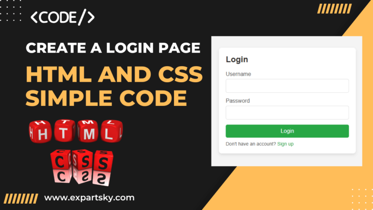
Creating a login page or signup page in HTML and CSS is an essential skill for web developers. A well-designed login form ensures a user-friendly experience and is a core feature of websites requiring user authentication. In this blog, you’ll learn how to build a login page and signup page from scratch, with sample HTML and CSS code. This tutorial covers every detail you need to create a login form in HTML and signup form with CSS.

login page

What You Will Learn

  1. How to set up a simple HTML structure for a login page.
  2. How to style the login form and signup form with CSS.
  3. Code examples to make the page responsive and visually appealing.

Step 1: Setting Up the HTML Structure for login Page

To start, create an HTML file called index.html. This file will contain the structure for both login and signup forms. The example below demonstrates how to use HTML to define the login page layout, including input fields for username and password.

HTML Code for Login and Signup Page

<!DOCTYPE html>
<html lang="en">
<head>
<meta charset="UTF-8">
<meta name="viewport" content="width=device-width, initial-scale=1.0">
<title>Login and Signup Form</title>
<link rel="stylesheet" href="style.css">
</head>
<body>
<div class="container">
<!-- Login Form -->
<div class="login-form">
<h2>Login</h2>
<form action="#">
<label for="username">Username</label>
<input type="text" id="username" name="username" required>

<label for="password">Password</label>
<input type="password" id="password" name="password" required>

<button type="submit">Login</button>
<p>Don't have an account? <a href="#" onclick="showSignup()">Sign up</a></p>
</form>
</div>

<!-- Signup Form -->
<div class="signup-form" id="signup-form">
<h2>Sign Up</h2>
<form action="#">
<label for="new-username">Username</label>
<input type="text" id="new-username" name="new-username" required>

<label for="new-email">Email</label>
<input type="email" id="new-email" name="new-email" required>

<label for="new-password">Password</label>
<input type="password" id="new-password" name="new-password" required>

<button type="submit">Sign Up</button>
<p>Already have an account? <a href="#" onclick="showLogin()">Login</a></p>
</form>
</div>
</div>

<script>
function showSignup() {
document.querySelector('.login-form').style.display = 'none';
document.querySelector('#signup-form').style.display = 'block';
}
function showLogin() {
document.querySelector('.login-form').style.display = 'block';
document.querySelector('#signup-form').style.display = 'none';
}
</script>
</body>
</html>

Explanation of HTML Code

  • Container: The <div class="container"> is used to contain both the login form and signup form.
  • Login Form: A basic login page with fields for username and password, and a button to submit.
  • Signup Form: A form with fields for username, email, and password.
  • JavaScript Toggle: The JavaScript functions showSignup() and showLogin() toggle between the login page and signup page.

Step 2: Adding CSS Styling

Now that the HTML structure is ready, let’s add CSS to style the login page. Create a CSS file called style.css and add the following code.

CSS Code for Login and Signup Page

* {
margin: 0;
padding: 0;
box-sizing: border-box;
font-family: Arial, sans-serif;
}

body {
display: flex;
justify-content: center;
align-items: center;
height: 100vh;
background-color: #f4f4f4;
}

.container {
width: 100%;
max-width: 400px;
padding: 20px;
background-color: #ffffff;
box-shadow: 0 4px 8px rgba(0, 0, 0, 0.1);
border-radius: 8px;
}

h2 {
margin-bottom: 20px;
color: #333;
}

form {
display: flex;
flex-direction: column;
}

label {
margin-bottom: 5px;
color: #555;
}

input {
margin-bottom: 15px;
padding: 10px;
border: 1px solid #ddd;
border-radius: 5px;
font-size: 16px;
}

button {
padding: 10px;
background-color: #007bff;
color: white;
border: none;
border-radius: 5px;
font-size: 16px;
cursor: pointer;
}

button:hover {
background-color: #0056b3;
}

p {
margin-top: 10px;
font-size: 14px;
color: #555;
}

a {
color: #007bff;
text-decoration: none;
}

a:hover {
text-decoration: underline;
}

.signup-form {
display: none; /* Hides the signup form initially */
}

Explanation of CSS Code

  • General Styles: We set a basic style for the body, headings, and container. The container centres the form on the screen.
  • Input Fields: Styled with padding, border-radius, and font-size for a clean look.
  • Button: A button with a background color and hover effect, improving the user experience.
  • Toggle Display: The .signup-form is hidden by default using display: none;. JavaScript then toggles between forms.

Step 3: Testing and Finalizing

Open the index.html file in your browser. You should see a login page with an option to switch to the signup form. When you click “Sign up,” the signup page will appear, and clicking “Login” will toggle back to the login page.

Additional Tips

  1. Responsive Design: The design is already responsive due to the max-width and centering, so it will look good on both mobile and desktop devices.
  2. Customizations: Feel free to change colors, fonts, and button styles in the CSS to match your website’s theme.
  3. Security Note: This HTML login page does not include backend security, so make sure to implement appropriate security measures for real-world projects.

Conclusion

Creating a login page and signup form using HTML and CSS is straightforward and gives you control over the design and layout. By following this tutorial, you’ve built a functional and responsive login and signup page that users will find visually appealing and easy to use. A well-crafted login page enhances user experience, contributing positively to your website’s credibility.

With this guide, you’re ready to create a stylish login form in HTML. Whether it’s for a personal project, blog, or business website, having a login page and signup page is essential for user interaction.

How to Create a Signup Form Using HTML CSS Code: with in 2 minute

How to Make a Registration Form in HTML CSS Code:

Build a responsive signup and registration form using free HTML CSS code. Learn easy steps for creating mobile-friendly forms with perfect alignment.

HTML CSS Code

We will also cover the following key points:

  • Signup form in HTML CSS
  • Adding fields for users to input their information
  • How to properly style and align the form
  • Best practices for creating a clean and responsive form
  • Step-by-step explanations to help you follow along easily

This blog is perfect for beginners or students who are learning how to use HTML CSS code to build forms. Let’s get started!

What is a Signup Form?

A signup form is a simple form that allows users to create an account or register on a website. The form usually contains fields such as:

  • Full Name
  • Email Address
  • Password
  • Confirm Password
  • Other optional information like phone number, address, etc.

Signup forms are essential for websites where user interaction is required. Now, let’s see how we can create a signup form using HTML CSS code.


Step 1: Structuring the Signup Form with HTML

First, we’ll create the basic structure of the form using HTML. HTML is responsible for laying out the content and the different fields in your signup form. You can create a form template in HTML CSS code that includes input fields for the user’s information.

COPY THIS CODE SNIPPET:

<!-- HTML code snippet -->
<!DOCTYPE html>
<html lang="en">
<head>
<meta charset="UTF-8">
<meta name="viewport" content="width=device-width, initial-scale=1.0">
<meta http-equiv="X-UA-Compatible" content="ie=edge">
<title>Responsive Signup Form</title>
<link rel="stylesheet" href="style.css"> <!-- Linking to external CSS file -->
</head>
<body>

<div class="signup-container">
<form class="signup-form">
<h2>Sign Up</h2>

<!-- Full Name Input -->
<div class="form-group">
<label for="fullname">Full Name</label>
<input type="text" id="fullname" name="fullname" placeholder="Enter your full name" required>
</div>

<!-- Email Input -->
<div class="form-group">
<label for="email">Email Address</label>
<input type="email" id="email" name="email" placeholder="Enter your email" required>
</div>

<!-- Password Input -->
<div class="form-group">
<label for="password">Password</label>
<input type="password" id="password" name="password" placeholder="Enter your password" required>
</div>

<!-- Confirm Password Input -->
<div class="form-group">
<label for="confirm-password">Confirm Password</label>
<input type="password" id="confirm-password" name="confirm-password" placeholder="Confirm your password" required>
</div>

<!-- Phone Number Input -->
<div class="form-group">
<label for="phone">Phone Number</label>
<input type="tel" id="phone" name="phone" placeholder="Enter your phone number" required>
</div>

<!-- Date of Birth Input -->
<div class="form-group">
<label for="dob">Date of Birth</label>
<input type="date" id="dob" name="dob" required>
</div>

<!-- Gender Selection (Radio Buttons) -->
<div class="form-group">
<label>Gender</label>
<div class="gender-options">
<label for="male">
<input type="radio" id="male" name="gender" value="male" required> Male
</label>
<label for="female">
<input type="radio" id="female" name="gender" value="female"> Female
</label>
<label for="other">
<input type="radio" id="other" name="gender" value="other"> Other
</label>
</div>
</div>

<!-- Country Selection (Dropdown) -->
<div class="form-group">
<label for="country">Country</label>
<select id="country" name="country" required>
<option value="">Select your country</option>
<option value="India">India</option>
<option value="USA">USA</option>
<option value="UK">UK</option>
<option value="Canada">Canada</option>
<option value="Australia">Australia</option>
</select>
</div>

<!-- Terms and Conditions Checkbox -->
<div class="form-group">
<label>
<input type="checkbox" name="terms" class="check-agree" required> I agree to the <a href="#">terms and conditions</a>
</label>
</div>

<!-- Submit Button -->
<button type="submit" class="submit-btn">Sign Up</button>
</form>
</div>

</body>
</html>

Make sure to include the following input fields in your form:

  • Text field for the full name
  • Email input for the user’s email address
  • Password input
  • A submit button to send the form

This structure forms the foundation of the signup form. Once the structure is ready, it’s time to move on to the styling part with CSS code.


Step 2: Designing the Signup Form with CSS Code

After setting up the basic HTML structure, we will use CSS code to style and enhance the appearance of the form. CSS allows you to add visual elements like color, margins, padding, fonts, and responsiveness. This will make your signup form visually appealing and user-friendly.

COPY THIS CODE SNIPPET:

/* CSS code snippet */
* {
margin: 0;
padding: 0;
box-sizing: border-box;
}

body {
font-family: Arial, sans-serif;
background-color: #f4f4f9;
display: flex;
justify-content: center;
align-items: center;
padding:50px 0px;
}

.signup-container {
background-color: #fff;
padding: 25px;
border-radius: 10px;
box-shadow: 0 4px 8px rgba(0, 0, 0, 0.1);
max-width: 600px;
width: 100%;
}

.signup-form h2 {
text-align: center;
margin-bottom: 20px;
color: #333;
}

.form-group {
margin-bottom: 15px;
}

.form-group label {
display: block;
margin-bottom: 5px;
color: #333;
font-weight: bold;
}

.form-group input,
.form-group select {
width: 100%;
padding: 10px;
border: 1px solid #ccc;
border-radius: 4px;
font-size: 16px;
}

.gender-options {
display: flex;
justify-content: space-between;
margin-top: 5px;
}

.gender-options label {
display: flex;
align-items: center;
}

.gender-options input {
margin-right: 5px;
}
.check-agree{
width: fit-content !important;
}

.submit-btn {
width: 100%;
padding: 12px;
background-color: #28a745;
color: white;
border: none;
border-radius: 4px;
cursor: pointer;
font-size: 18px;
transition: background-color 0.3s;
}

.submit-btn:hover {
background-color: #218838;
}

.form-group a {
color: #007bff;
text-decoration: none;
}

.form-group a:hover {
text-decoration: underline;
}

/* Responsive Design */
@media (max-width: 480px) {
.signup-container {
padding: 20px;
width: 95%;
}

.form-group input,
.form-group select {
font-size: 14px;
}

.submit-btn {
font-size: 16px;
}
}

By adding CSS, you can:

  • Centre the form on the page using Flexbox or Grid.
  • Style the input fields to look clean and modern.
  • Adjust the size and appearance of the submit button.
  • Add hover effects to make the form interactive.

If you want your signup form to look professional, it’s essential to ensure good spacing, alignment, and consistent fonts. This makes your form easier to use and more visually attractive.


Step 3: Aligning the Form Using HTML and CSS Code

A crucial part of any form is its alignment. For users to fill out the signup form easily, all elements must be properly aligned. Using CSS Flexbox or CSS Grid can help ensure the form’s fields are aligned well.

Here’s how you can use HTML CSS code to align the signup form:

/* Aligning the Form CSS Code */
* {
margin: 0;
padding: 0;
box-sizing: border-box;
}

body {
font-family: Arial, sans-serif;
background-color: #f4f4f9;
display: flex;
justify-content: center;
align-items: center;
padding: 50px 0;
}

.signup-container {
background-color: #fff;
padding: 25px;
border-radius: 10px;
box-shadow: 0 4px 8px rgba(0, 0, 0, 0.1);
max-width: 600px;
width: 100%;
}

.signup-form h2 {
text-align: center;
margin-bottom: 20px;
color: #333;
}

.form-group {
margin-bottom: 15px;
}

.form-group label {
display: block;
margin-bottom: 5px;
color: #333;
font-weight: bold;
}

.form-group input,
.form-group select {
width: 100%;
padding: 10px;
border: 1px solid #ccc;
border-radius: 4px;
font-size: 16px;
}

.gender-options {
display: flex;
justify-content: space-between;
margin-top: 5px;
}

.gender-options label {
display: flex;
align-items: center;
}

.gender-options input {
margin-right: 5px;
}

.check-agree {
width: fit-content !important;
}

Proper alignment makes a huge difference in terms of user experience. A well-aligned signup form will not only look better but will also be more functional.


Step 4: Making the Signup Form Responsive

In today’s world, most users access websites through their phones. It’s crucial that your signup form works well on mobile devices too. This is where CSS media queries come in handy.

By adding media queries in your CSS code, you can adjust the form’s layout and size based on the screen size. Here’s how you can make your form template in HTML CSS responsive:

  • Use @media queries to detect screen size.
  • Adjust the width of the input fields for smaller screens.
  • Stack the form fields vertically when viewed on mobile devices.

You can place your responsive CSS code snippet here:

/* Responsive Design */
@media (max-width: 480px) {
.signup-container {
padding: 20px;
width: 95%;
}

.form-group input,
.form-group select {
font-size: 14px;
}

.submit-btn {
font-size: 16px;
}
}

With this step, your signup form will look good on all devices, from large desktops to small smartphones.


Step 5: Finalizing the Signup Form Template in HTML CSS

Once you’ve structured, designed, aligned, and made the form responsive, your signup form is almost complete! Now, you can finalize your form template in HTML CSS by adding finishing touches like:

  • Proper error handling using HTML attributes (e.g., required).
  • Placeholder text in input fields to guide users.
  • Customizing the submit button for a call-to-action (e.g., “Sign Up”).

With this, your form is ready for use. Now users can easily fill out and submit the form, and it will look clean and professional on all devices.


Best Practices for Creating a Signup Form

Now that you’ve learned how to create a signup form using HTML CSS code, here are some best practices to keep in mind:

  1. Use Clear Labels: Always provide clear labels for input fields to make it easier for users to understand what information is required.
  2. Keep It Simple: Don’t overload the form with too many fields. Keep it simple and ask for only the essential information.
  3. Ensure Accessibility: Use accessible attributes like aria-label to make sure the form is usable by all, including people with disabilities.
  4. Add Form Validation: Use HTML form validation (e.g., required, email) to ensure users provide the correct data before submission.
  5. Design for All Devices: Always make sure your form is responsive and looks good on both desktops and mobile devices.

Conclusion

Building a signup form using HTML and CSS is an essential skill for any web developer or student learning web development. By following the steps outlined in this guide, you now know how to create a functional and well-designed form using HTML CSS code.

Whether you’re creating a basic form template in HTML CSS or a more complex registration system, the key is to focus on structure, design, and responsiveness. With these skills, you can create signup forms that are both visually appealing and user-friendly.

Now that you know how to create a signup form using HTML and CSS, it’s time to get creative! Feel free to add additional fields, custom designs, or even JavaScript functionality to further enhance your form. Happy coding!